Mutely.
A brand built to make the internet a better place.
- Positioning & strategy
- Identity & system
- Campaign & digital
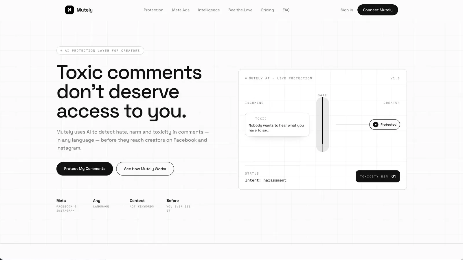
The product
A quiet gate between creators and the noise.
01 — The challenge
Moderation tools all look like a threat.
Mutely protects creators and communities from negative, harmful and unwanted comments.
The challenge wasn't building another moderation tool. It was building a brand that could say protection, control, simplicity and confidence — without looking like cybersecurity, corporate SaaS or generic AI.
02 — The positioning
Not fear. Control.
Presence positioned Mutely around one idea: taking control of what enters your digital space.
Confident, human, slightly provocative — a brand for creators who refuse to let the comment section decide how they feel.
03 — The big idea
Silence what doesn't deserve attention.
The identity is built on subtraction: a gate, a filter, a line drawn between what reaches you and what never will. Every element is calm on purpose — the brand itself feels like the noise has already been removed.
04 — The identity
A quieter internet, by design.
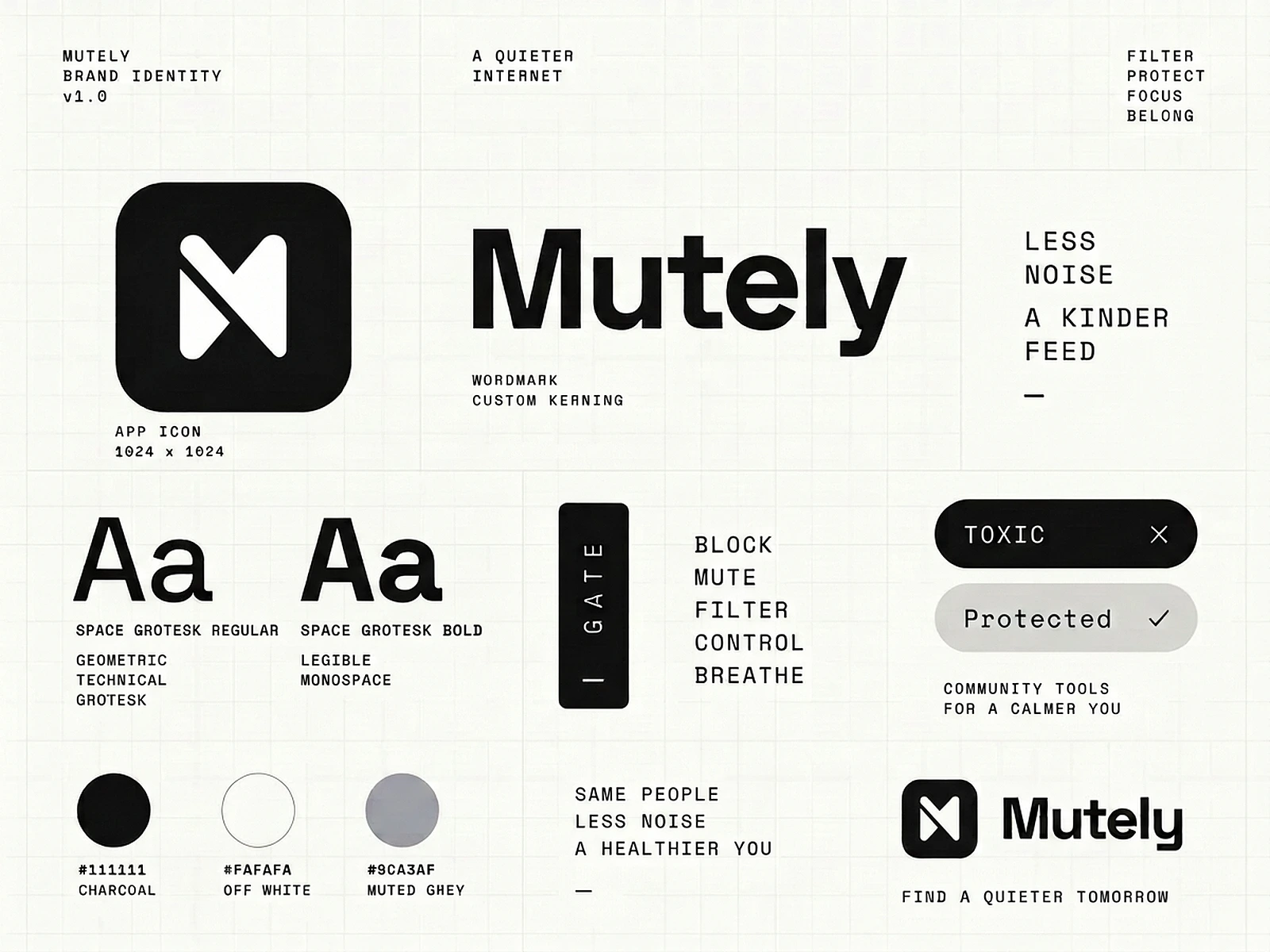
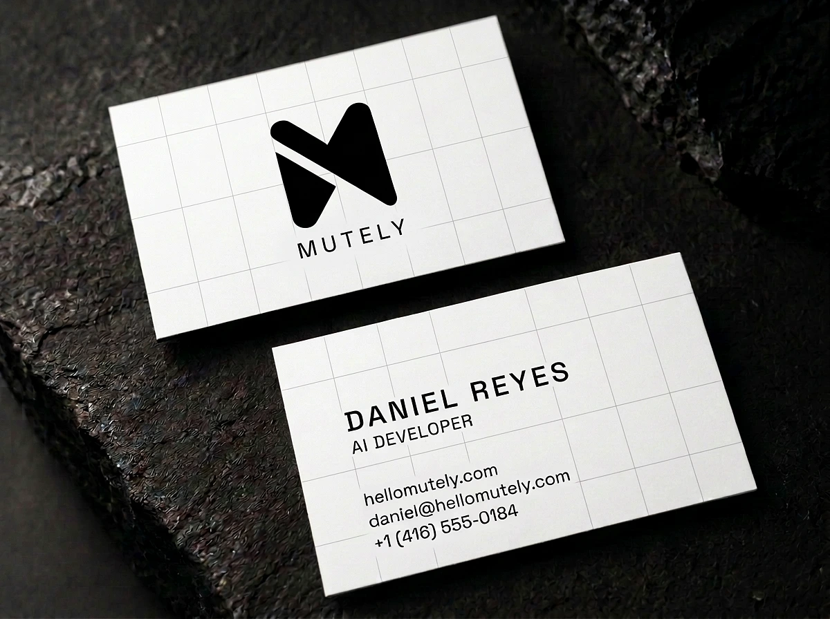
A black monogram, a clean grotesk wordmark, a technical monospace voice, and a palette of charcoal, off-white and muted grey.
Pills, gates and status labels became the graphic language — interface elements turned into identity.
05 — The brand in the real world
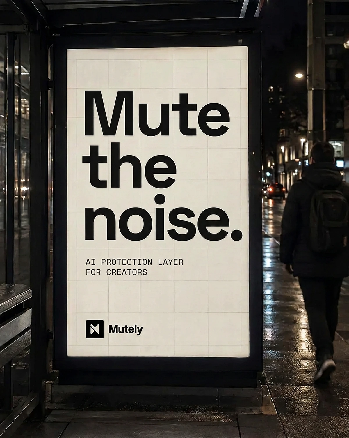
Said out loud, at city scale.
The campaign takes Mutely's promise off the screen and onto the street — one statement, one mark, nothing else.
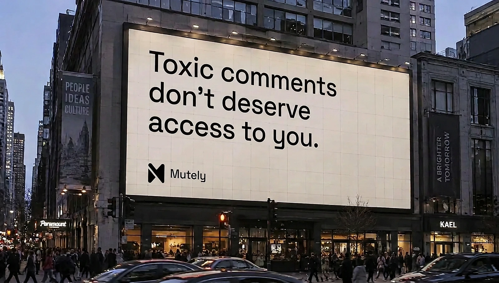
The billboard
06 — The digital world
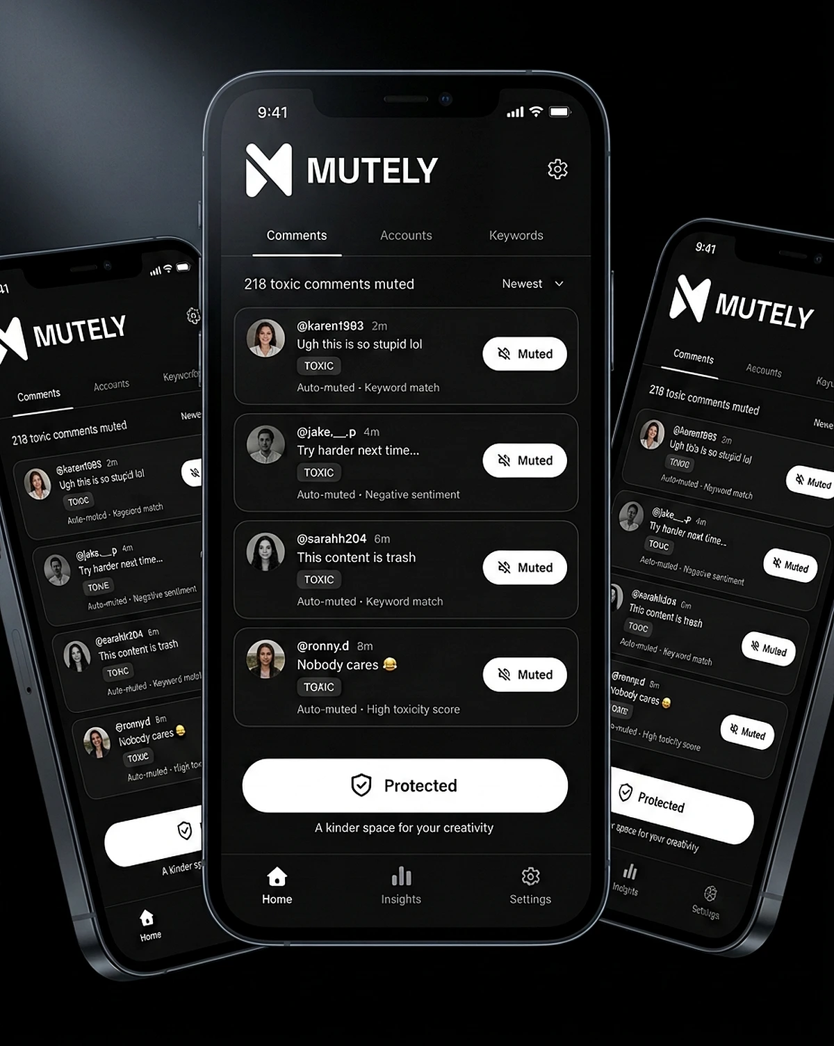
The product is the brand.
Website, product interface, social and ads share the same grid, pills and monospace labels — so every touchpoint feels like the same calm system.
07 — The brand system
One language. Endless expressions.
Typography, status pills, the gate, monochrome photography and short, confident statements combine to create billboards, cards, screens and posts that all feel unmistakably Mutely.
08 — The result
From a product to a point of view.
Presence turned Mutely from a moderation feature into a recognisable brand — one that creators trust because it feels as calm as the space it protects.
Less noise.More you.
Next project
DATE.View case study →